ApostiSign
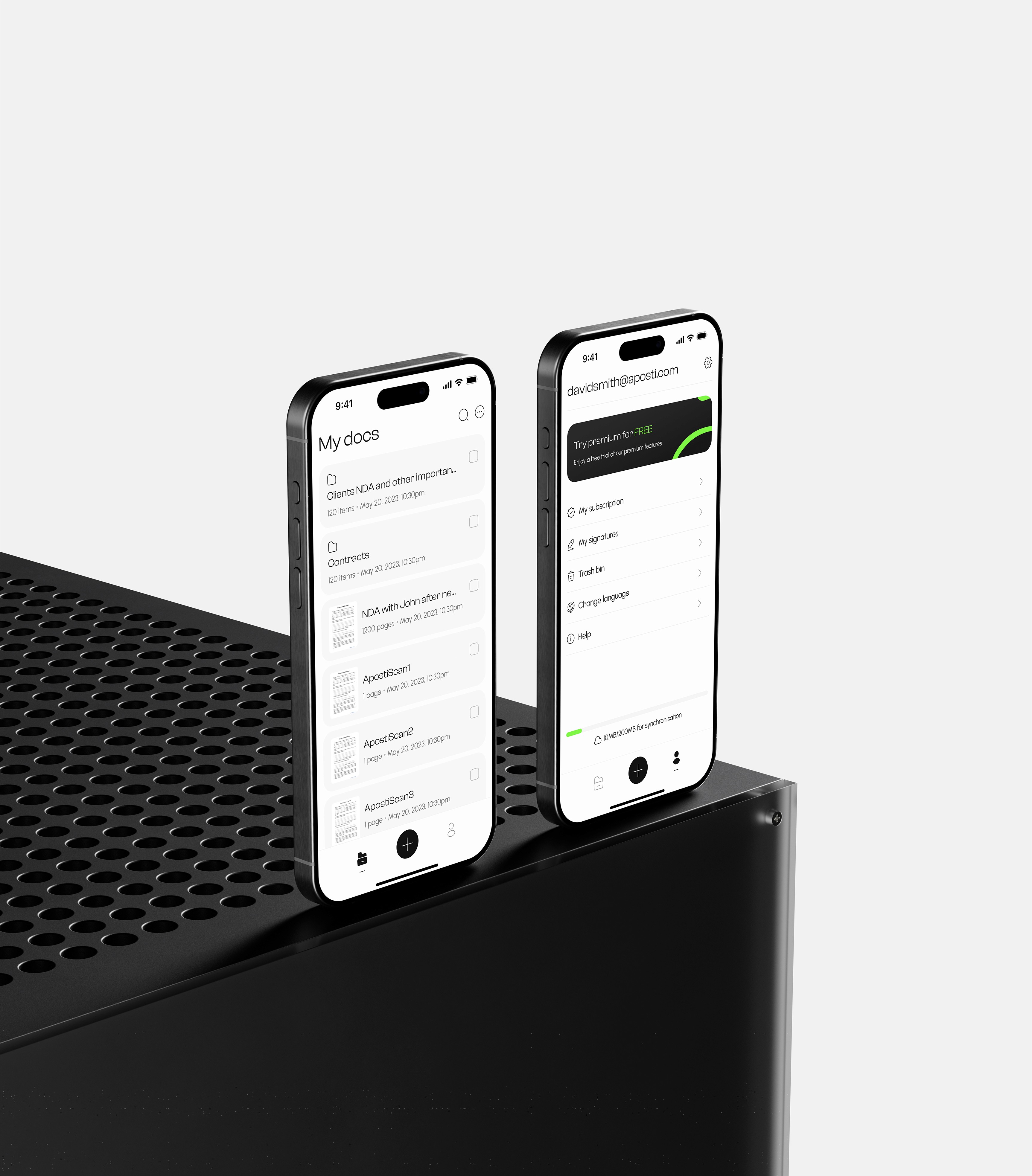
ApostiSign is a cross-platform product that combines document scanning, e-signing, signature requests, and cloud storage. The primary goal is to create an ecosystem where users can easily manage their documents, eliminating the need for multiple products.
Background
People have to scan documents in one app (ex. Camscanner), transfer them to another to send a signature request (ex. Docusign), and then use yet another program just to store them (ex. Google Drive).
Team
Product manager
Business analyst
Product designer
Mobile developer
Back-end developers
Front-end developer
QA
My role
Product vision and design workshops;
Users and competitors research;
Prototyping , UI design, usability testing;
Design system
Branding and visual identity.
Key results
4.7/5 – users feedback for mobile app in beta version.
Successful hand off of web app to development (full release is planned for Sep 2024).
Ability to update and iterate flows quickly, due to design system and smart components approach.
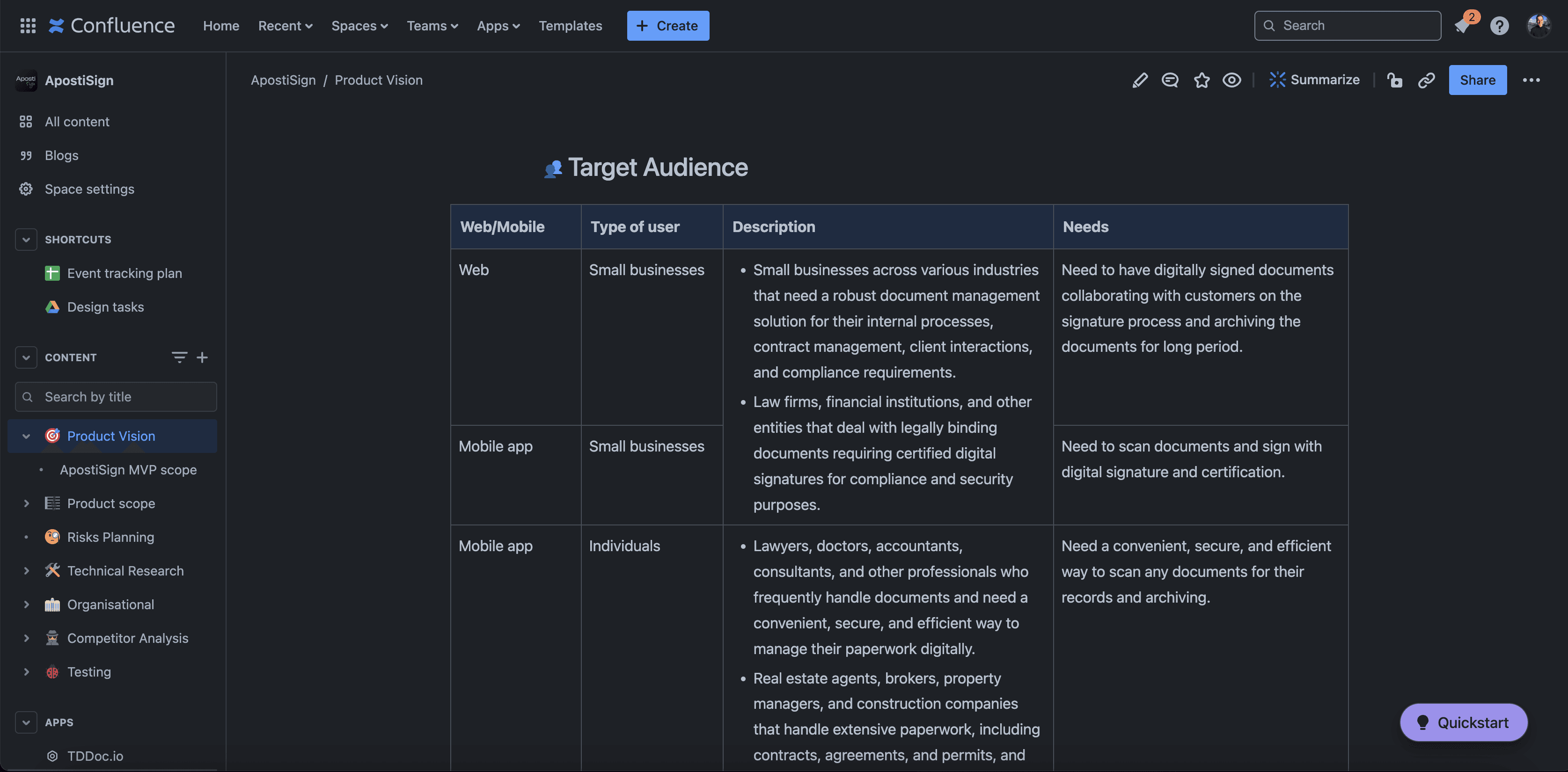
Product vision and design workshops
I organized and moderated a product vision workshop, which served as the foundation for the development of our subsequent product. Naturally, our product vision underwent significant changes throughout the process, as new ideas, insights, and constraints emerged constantly. However, this document became the cornerstone from which we could pivot and progress.
Users & competitors research
Objective
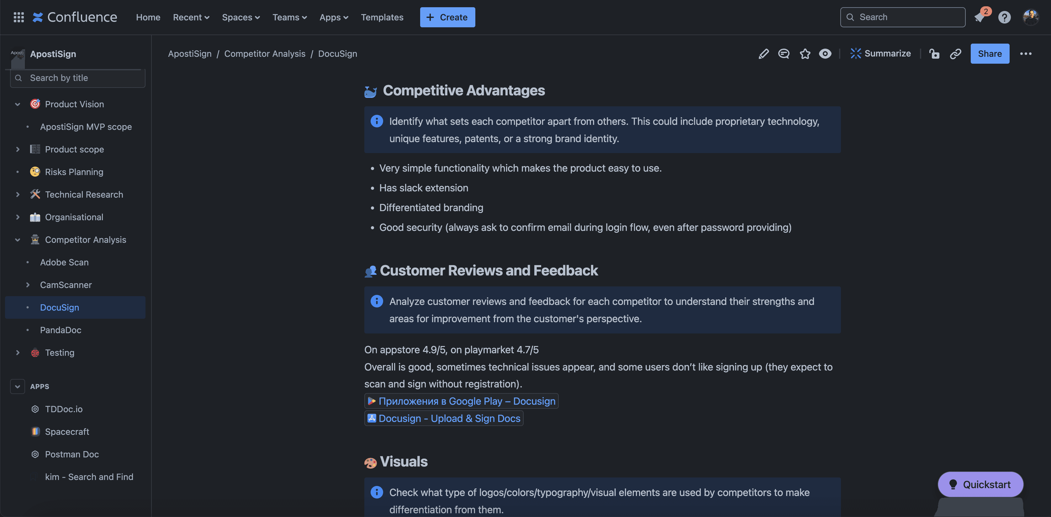
I conducted in-depth interviews with 10 users who actively use digital products for document management and conducted competitor research on 4 main competitors.
Key findings
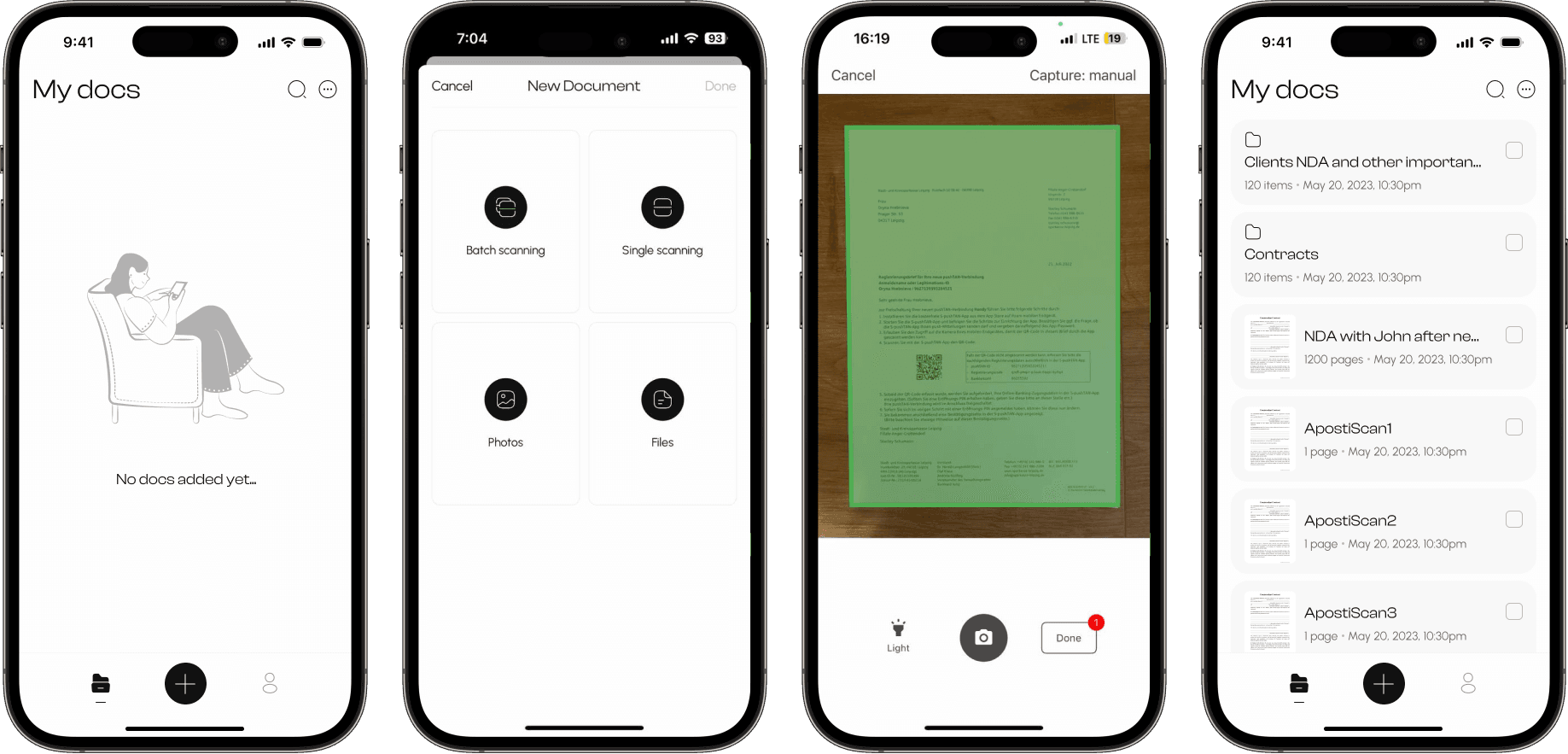
Users often need to create a document from different sources.
The automatic frame capture is annoying.
In poor lighting conditions, users often use the flashlight on their phones to assist in scanning documents.
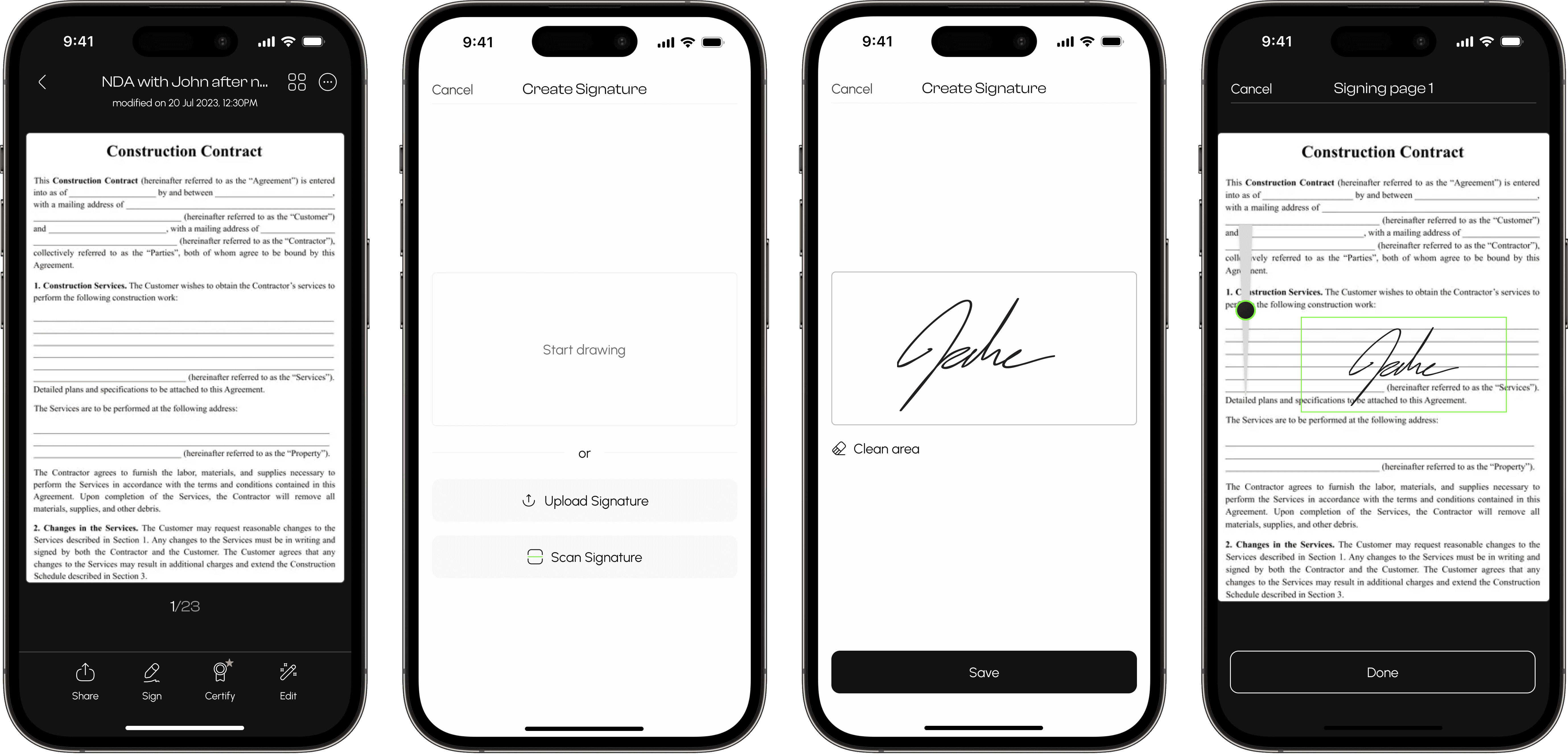
It's annoying to flip the phone to create a signature.
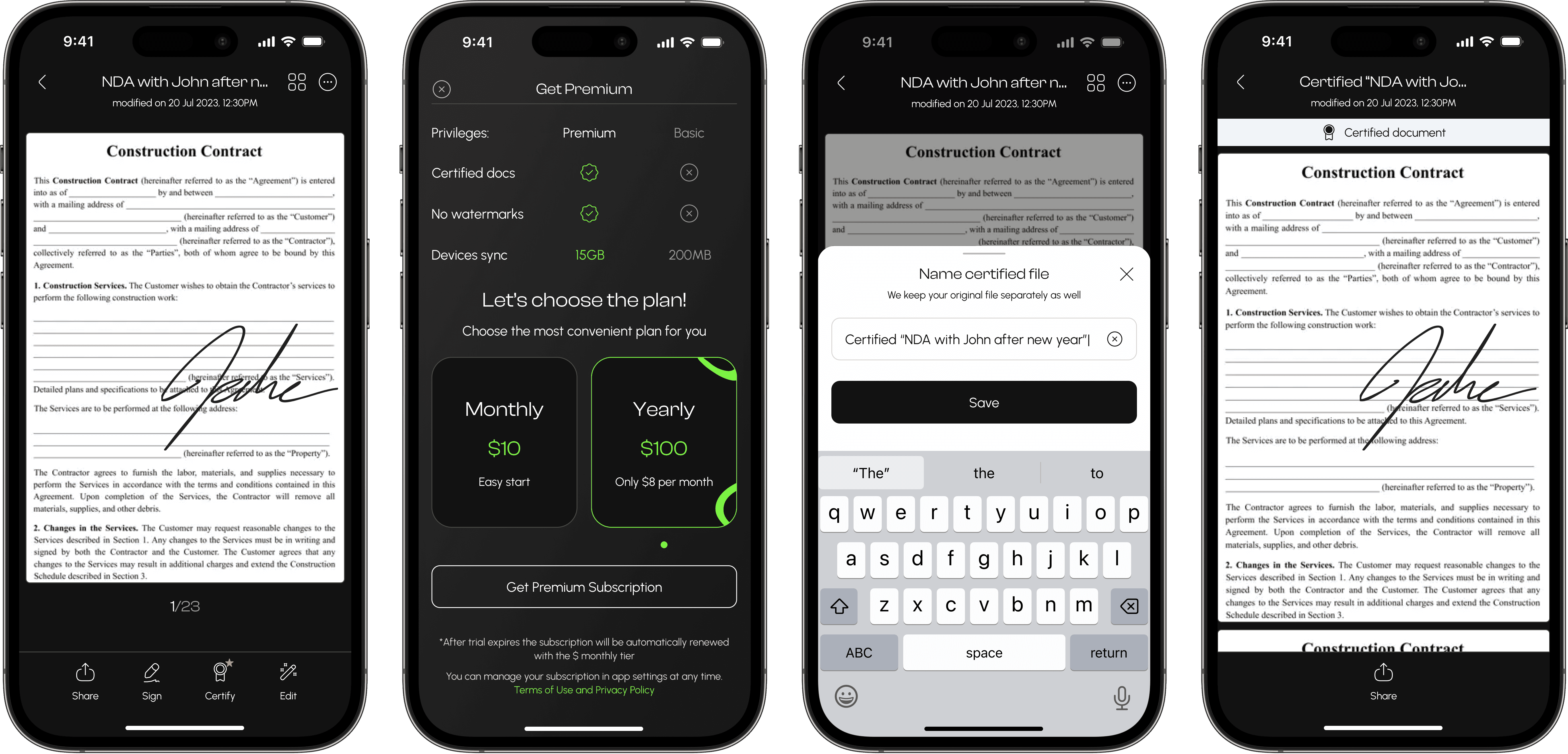
People typically create a new folder every time after certification, to save the original and certified document in one folder.
Scanning
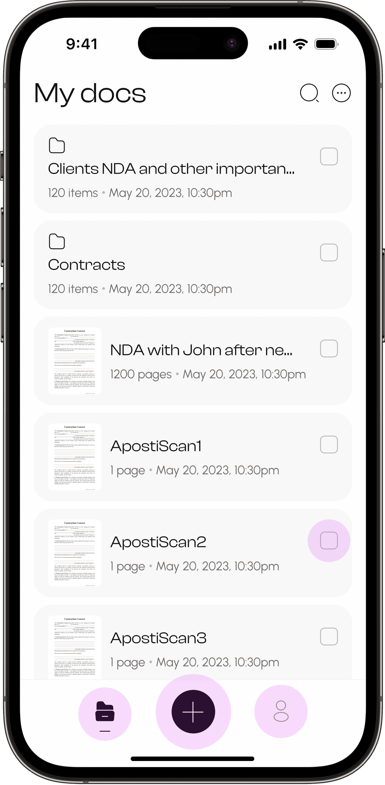
During research, we learned that the scanning process can be a rather spontaneous event and people want to start scan documents as quickly as possible, so we introduced the option for new users to start scanning immediately as a guest, skipping the registration process.
Also we found out, that some users find automatic page scanning intrusive, so we made manual scanning the default option.
Moreover we discovered that poor lighting conditions often causing annoyance among users during scanning, so we incorporated a flashlight function for scanning to illuminate pages.
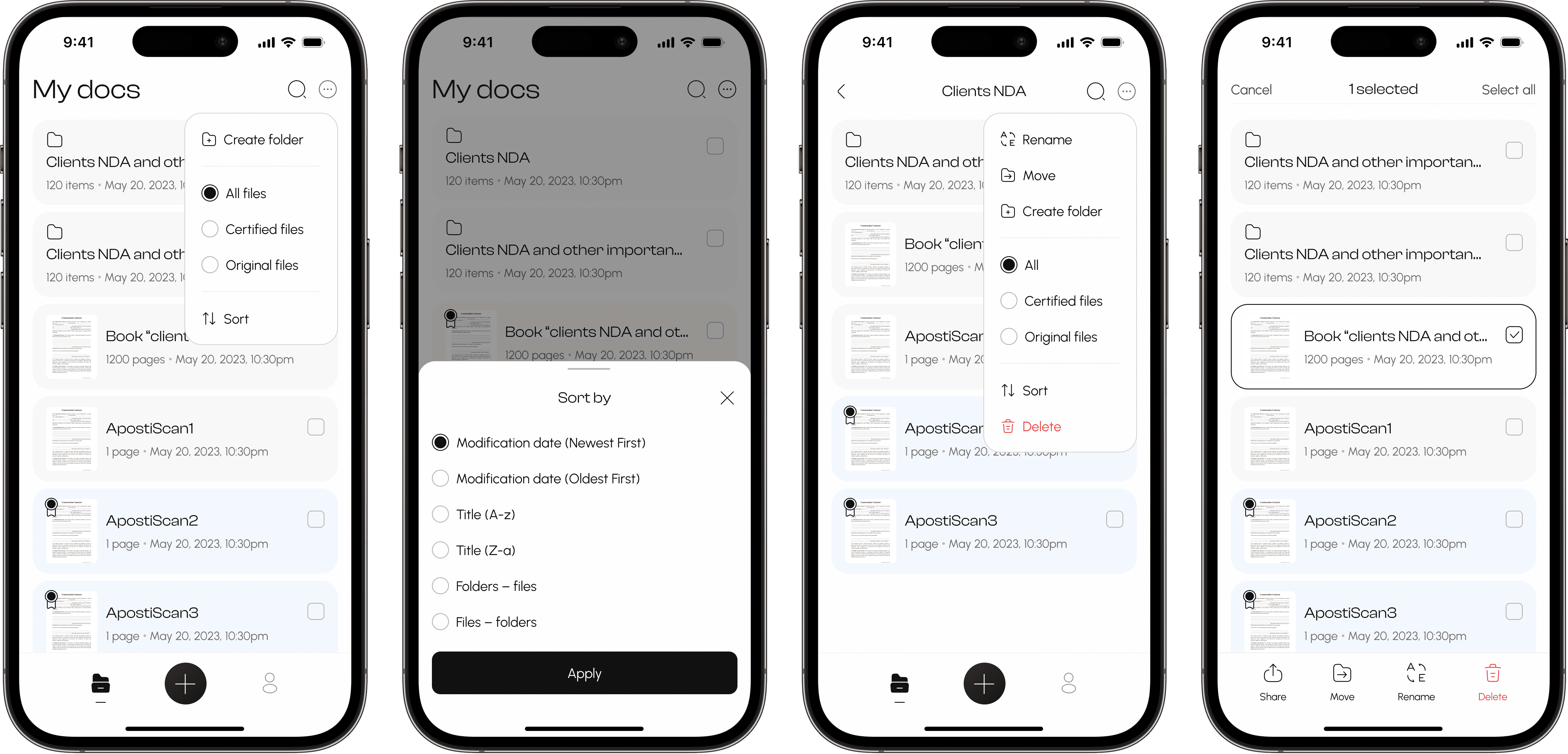
Docs list actions
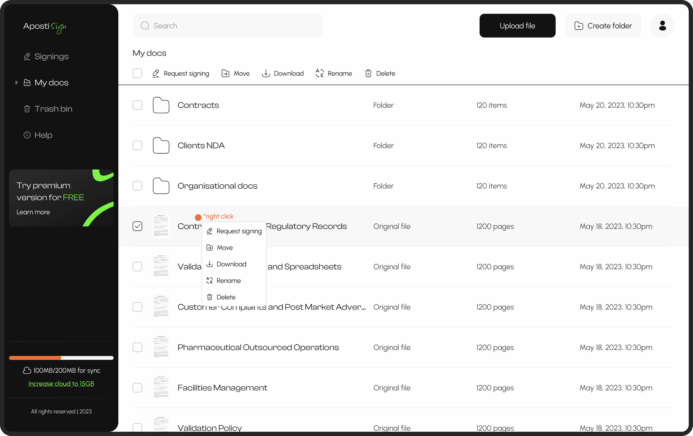
One of the biggest challenges we faced was prioritizing and navigating through the multitude of actions required for various types of documents. We recognized the importance of each function and its potential utility to users – such as the pin file function (currently in backlog) – but we needed to strike a balance between resource allocation and practicality. To tackle this, we opted to analyze our competitors and align ourselves with the best practices in the market. From there, we could systematically refine and incrementally add features, ensuring a strategic approach to product development.
Sign & Certify
Signing
During the signing process, there's also a very interesting insight. If you recall most signing applications, to create a signature, you need to turn your phone horizontally. Yes, this makes sense to some extent, but we found out that this flipping back and forth of the phone actually annoys people. So, we decided to keep the signature creation in a vertical position.
Certification
Certification is one of the paid features that officially approves a document and makes it legitimate. One of the tasks to address was naming this document because we kept the original. Therefore, it was decided to automatically name the file with the original name but with the prefix 'certified.' Additionally, the renaming screen appears immediately after certification, so the person has full control over this process and can change the name as desired. Our task is simply to facilitate this decision.
Cloud synchronization
Cloud synchronization is a function that allows files to be synchronized across devices. This means that after scanning a file on your phone, you can access and manage that file on your desktop. The available memory for synchronization varies between the free and paid versions, so it was crucial for business to highlight the moment when the memory runs out to encourage users to purchase a paid subscription. Therefore, when there is only 50MB of memory left, the user receives a notification, and a memory progress bar is added to the "My Docs" screen with a button to increase memory, leading to a subscription.
Additionally, when memory runs out, we change the information about the number of pages to the weight of the document, thus giving the user an understanding of which files take up the most space.
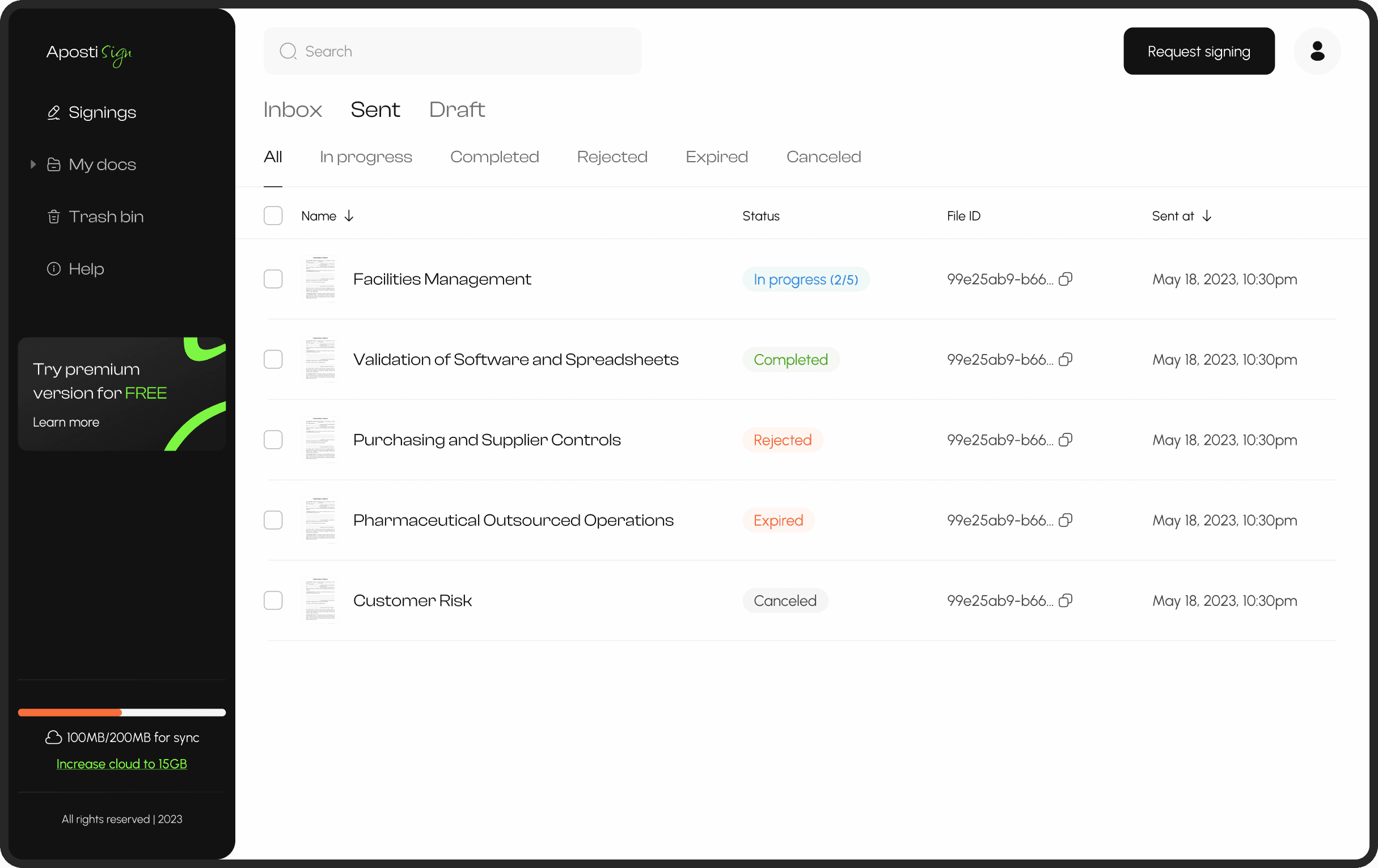
Signings inbox
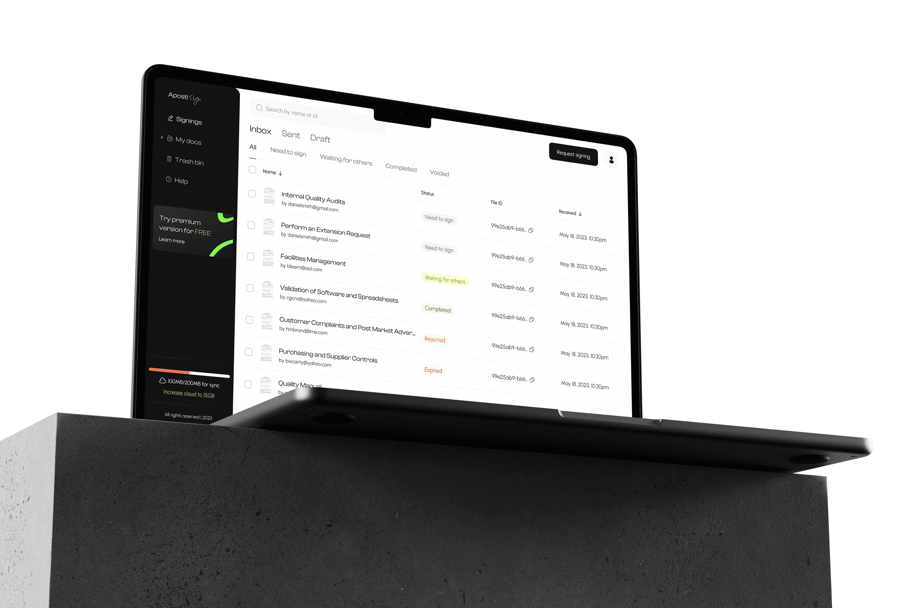
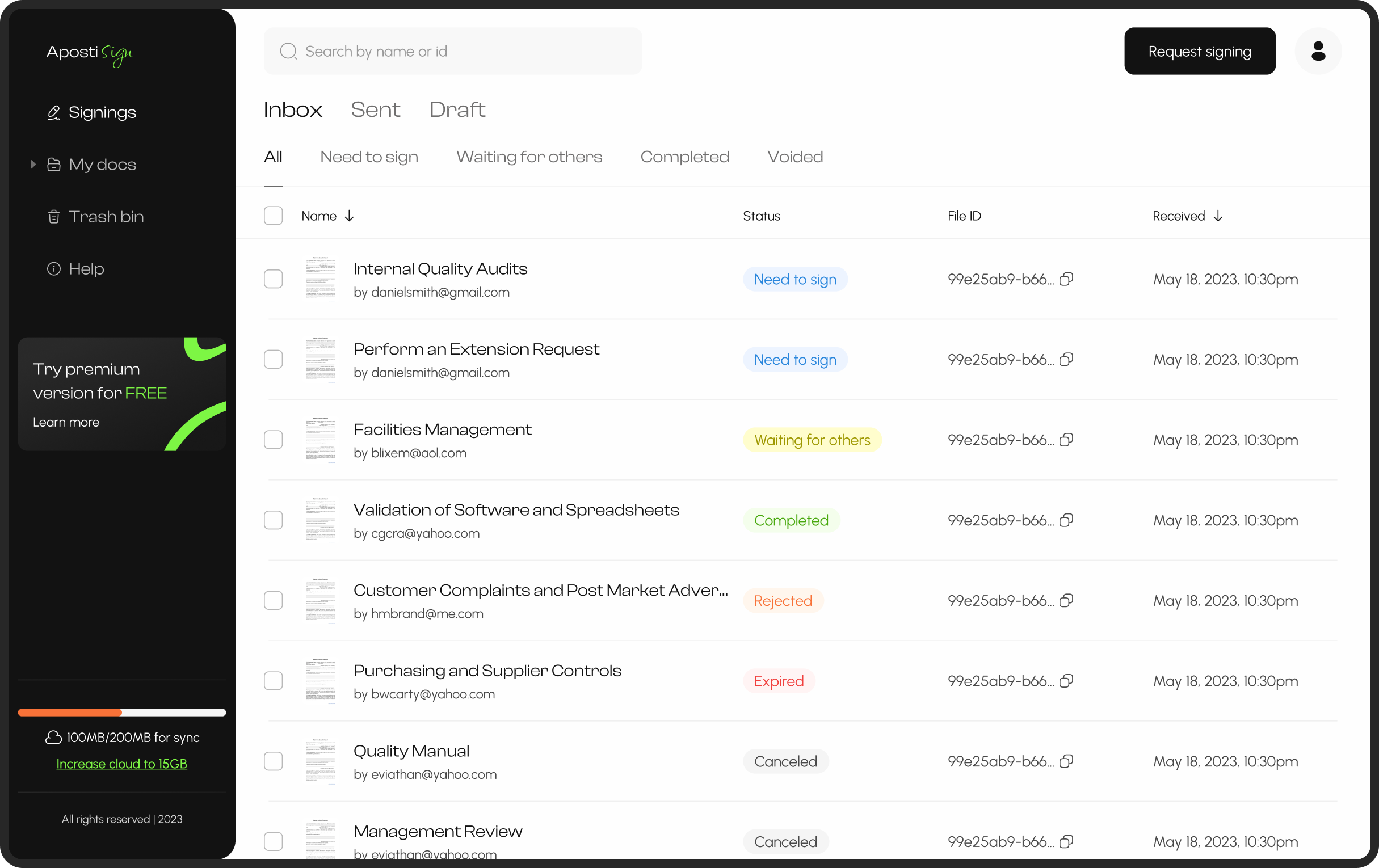
Initially, we had planned to exclude a signing section and reserve it for future iterations. However, after talking to users and reanalyzing the market, we opted to incorporate the ability to send and receive documents for signing in the first release. Below, you can find the inbox section, where users can view all received documents along with their respective statuses.
Subscription
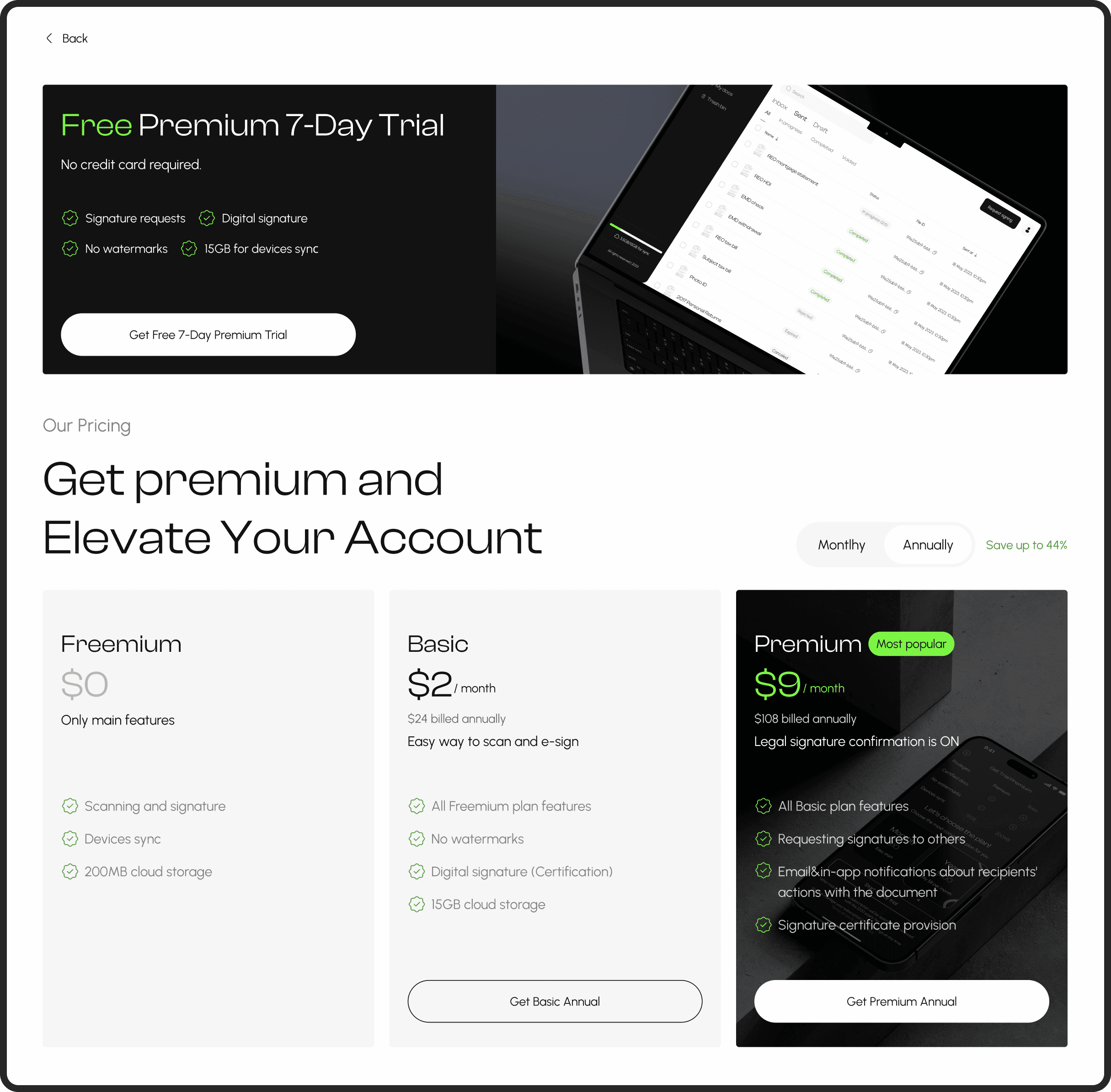
Unlike the mobile version, which had native subscription and payment options, deciding on a payment system for the web posed a challenge. After evaluating various solutions available on the market, we opted to integrate the Stripe system. This decision was based on Stripe's support for a wide range of payment methods, its adaptability to different countries and regions, and its clarity for users from a UX perspective.
My docs
The section where users can store their essential documents is intentionally designed to resemble the "signings" section, allowing for consistency and ease of navigation between tabs without the need for frequent readjustment. One of the primary challenges encountered was managing the numerous actions associated with different types and varying numbers of documents.
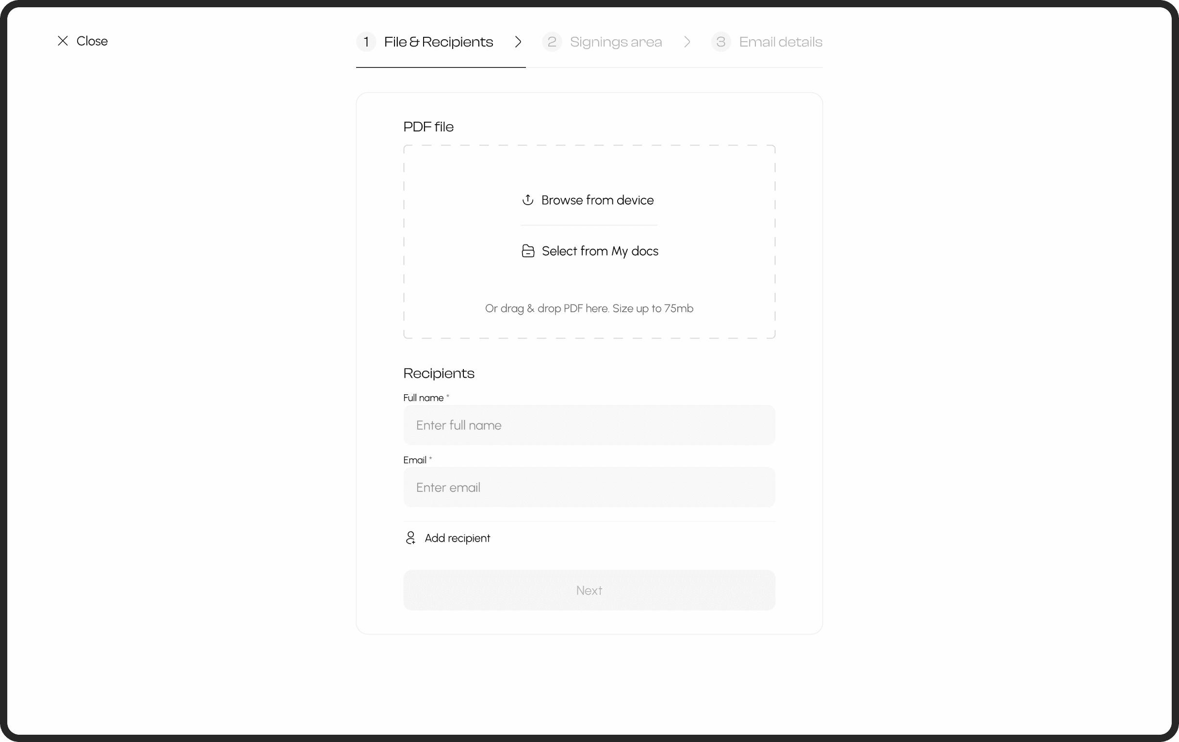
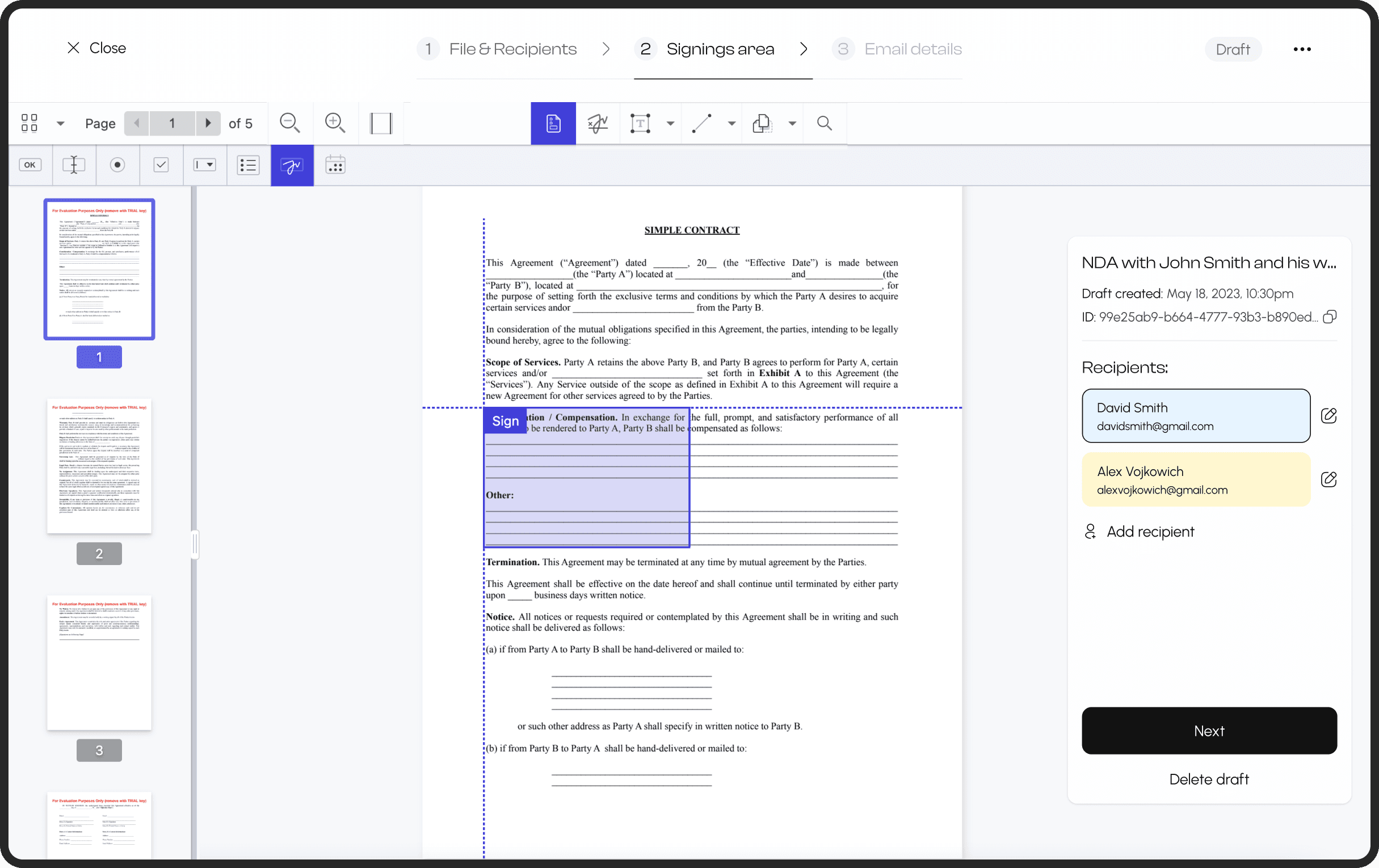
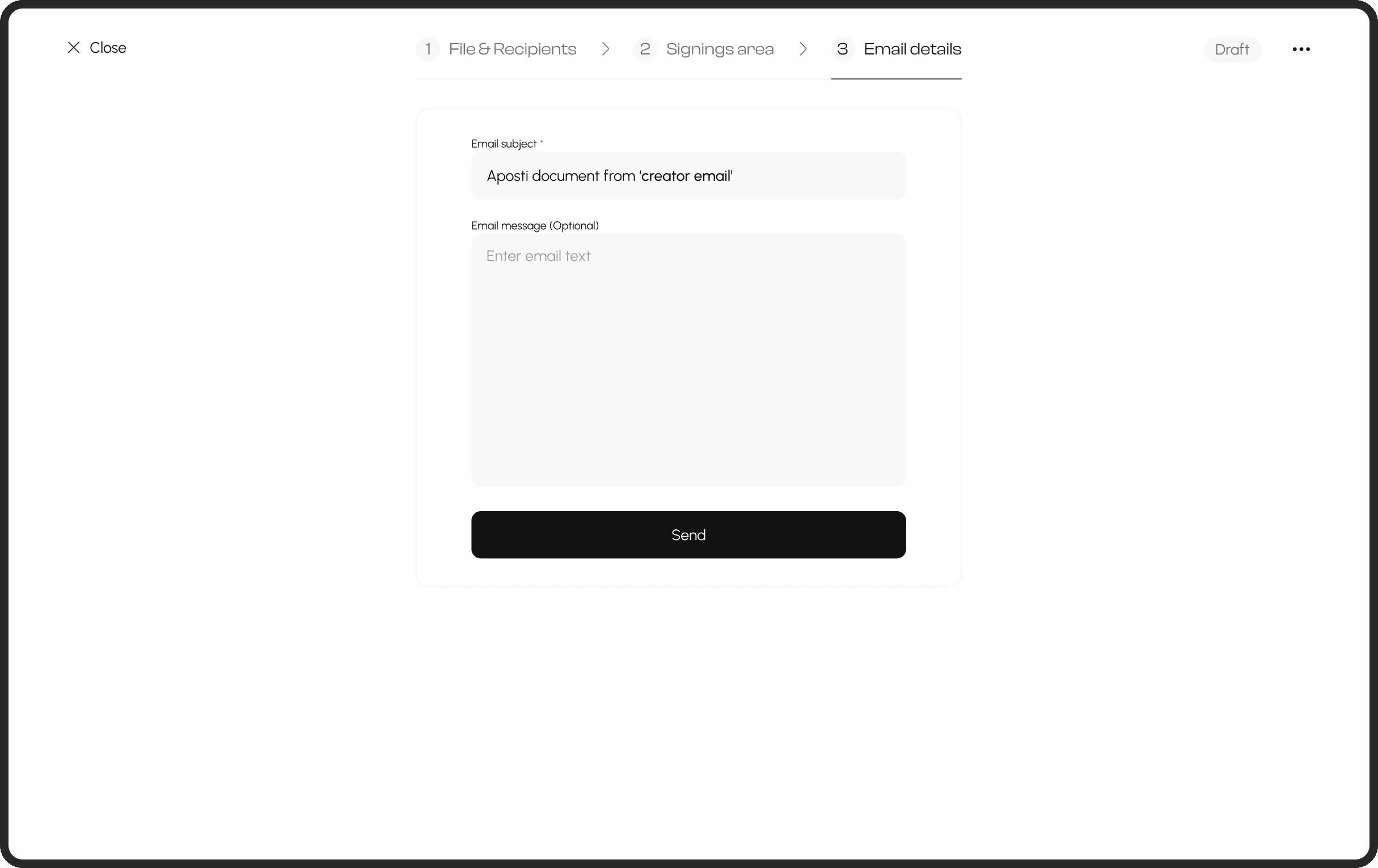
Send signature request
The signing process currently faces limitations in terms of UX due to constraints within the technical library, preventing modification of actions located above the page. Despite this challenge, efforts have been made to enhance UX as much as possible. Consequently, the types of overlays (such as signature, date, text field, etc.) are now immediately active. This adjustment aims to reduce user effort in locating these elements since they are positioned on the second level within the library, where technical adjustments are not feasible. However, the product intends to upgrade and transition away from the library once resources permit.
Design system
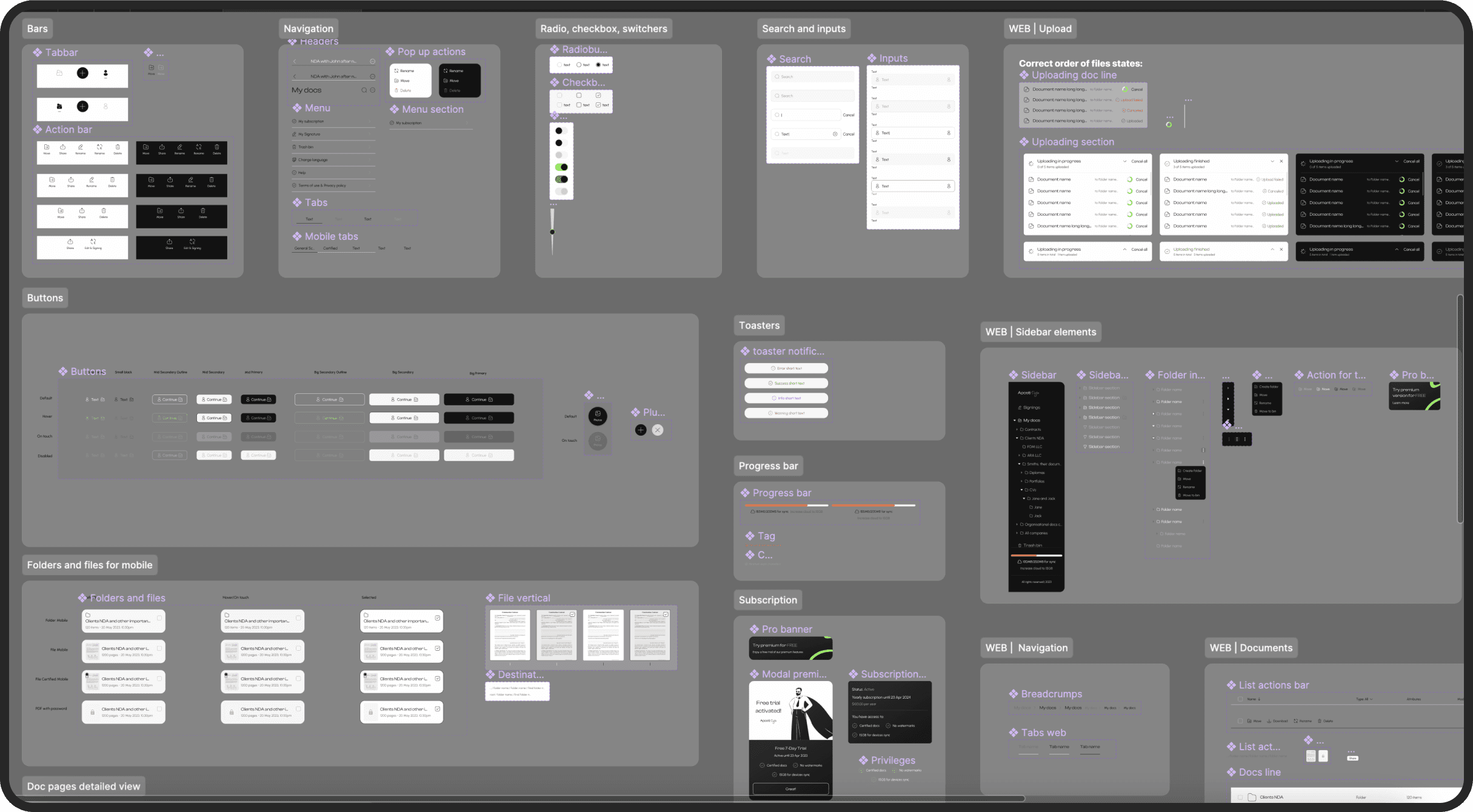
Considering the size and multi-platform nature of the product, I strategically opted to implement a design system from the start. This decision was aimed at ensuring consistency across platforms and expediting the development of future flows.
Main lessons learned
The designer should actively participate with developers in analyzing the technical library to evaluate its usability.
All changes during the project, whether in the team or in the business strategy, can significantly delay the release. However, there's nothing wrong with that; the main thing is to stay focused on your goal.
Corner cases can significantly impact decisions, so it's always worthwhile to consider them in advance.

