Stokkr
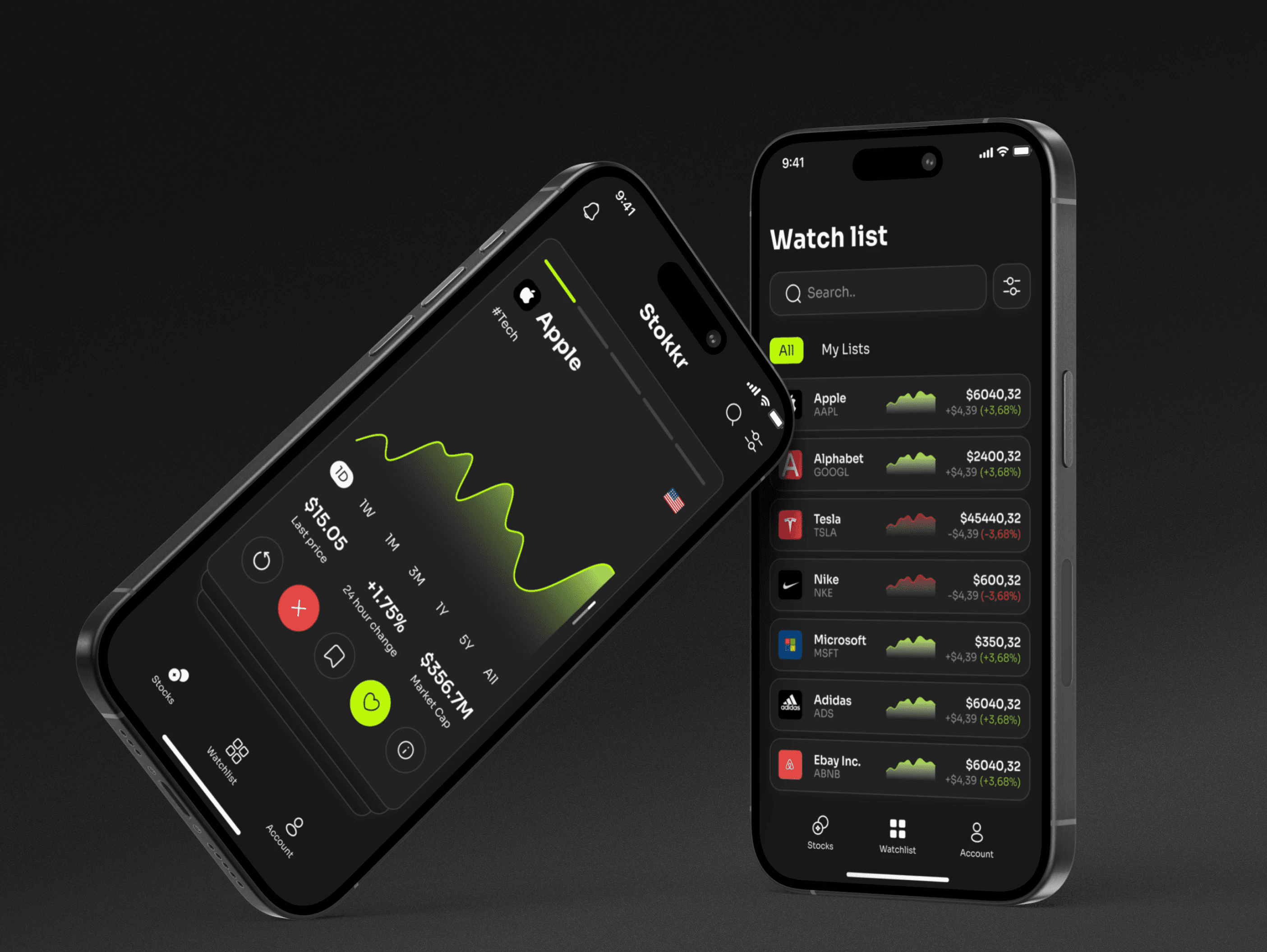
Stokkr is an stocks platform that combines the user-friendly design of modern fintech apps with the robust research tools found in established investor platforms.
Background
There are many professional products available for this purpose, but most of them are very complex and visually overwhelming. On the other hand, user-friendly apps often lack the professional data needed for stock analysis.
Team
Project manager
Product designer
Mobile developer
Back-end developer
QA
My role
Competitors research
Users research;
IA & Prototyping
UI design
Competitors research
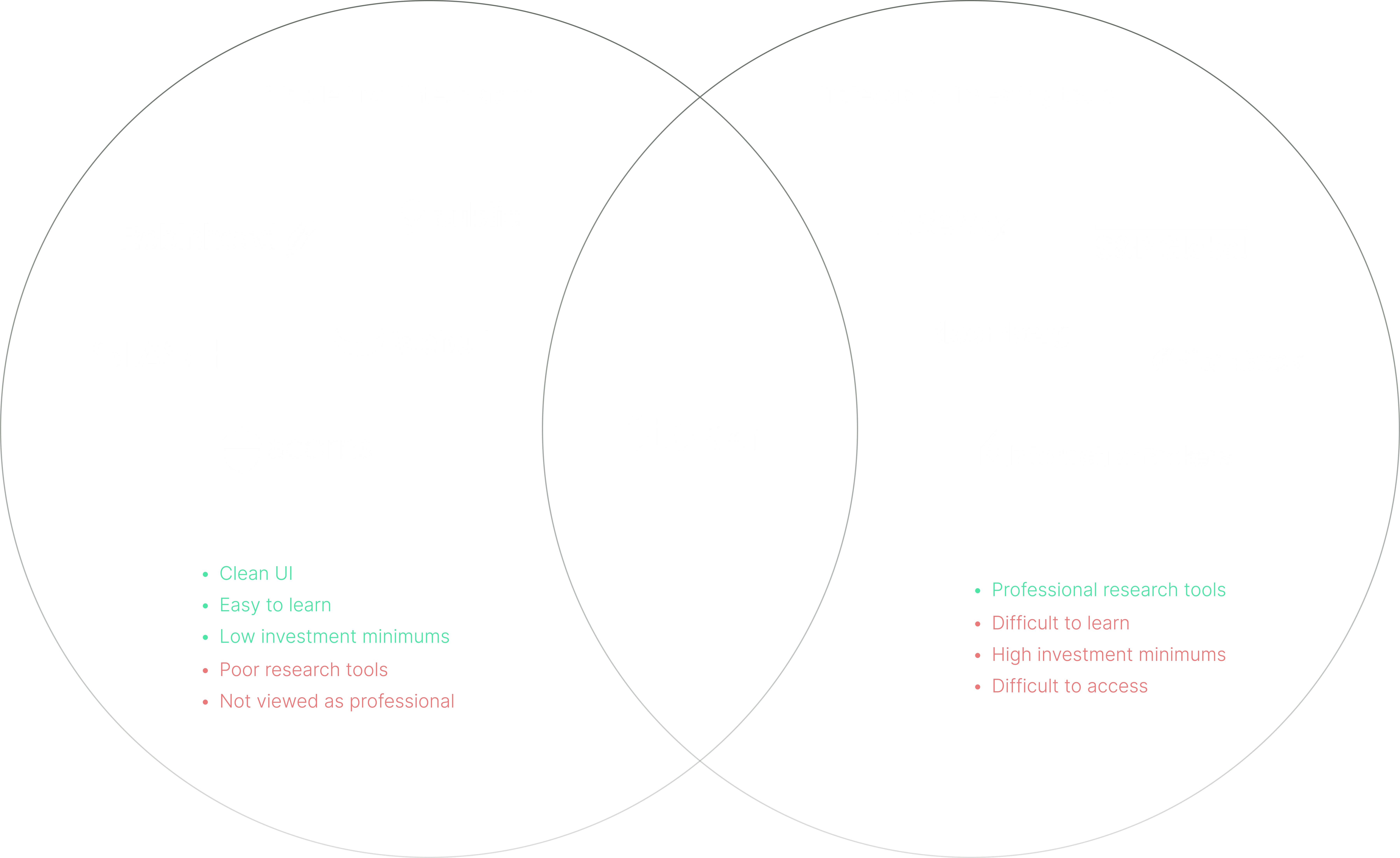
I analyzed five mobile-first fintech apps and five professional investing tools. Mobile-first apps had advantages like clean UI, ease of learning, and low investment minimums but lacked robust research tools and professional perception. Professional tools provided advanced analysis and in-depth insights but had steep learning curves, high investment minimums, and limited accessibility. By understanding both, we can position Stokkr to offer a balance of user-friendly design and sophisticated analysis tools, catering to diverse investors' needs.
Users & competitors research
Objective
Through In-Depth Interviews (IDIs), I identified two primary personas: the Novice Investor and the Intermediate Investor.
The Novice Investor is new to investing, seeking simplicity and guidance to build confidence and knowledge with straightforward options. Their goal is to establish a solid foundation for investing.
The Intermediate Investor has some experience and aims to expand their portfolios with more sophisticated tools and insights. They face challenges in decision-making and strive for diversification and sustainable growth.
Understanding these personas allows us to tailor the Stokkr app for a seamless and supportive experience, enhancing user satisfaction and empowering them to achieve their financial goals.
Key users pains
Interfaces that are difficult to understand.
Many unfamiliar terms.
Information overload.
Modern-looking services lack advanced analytics.
Using professional tools makes me feel outdated, as the user interface resembles Windows 95.
Key users needs
Choose and watch stocks easily.
Access advanced research and analysis tools with an easy-to-use interface.
Stay updated on market changes quickly and from anywhere.
Monitor news related to invested companies to mitigate risks effectively.
Acquaintance & Onboarding
Explain who we are
From a business standpoint, it was crucial for us to highlight the fusion of professionalism and modernity even before users embarked on the registration process. This ensured that users clearly grasped our product's dual nature: advanced yet user-friendly, with a plethora of features and settings complemented by contemporary interaction patterns.
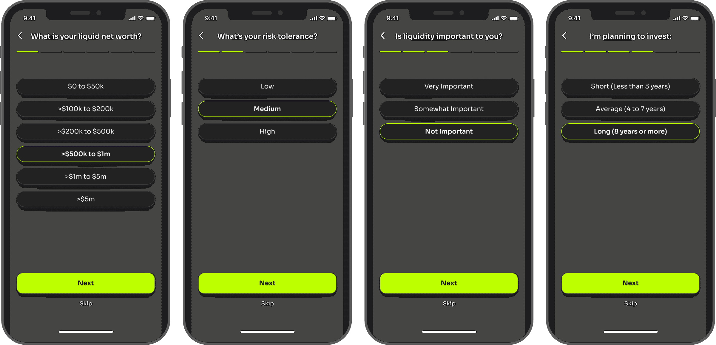
Personalized stock recommendations
Since the app utilizes a swipe format for recommended stocks, ensuring the relevance of these recommendations to the user's experience, financial situation, and plans was paramount. Therefore, immediately after registration, we implemented a flow where users can set their main parameters, which will then be used to tailor the recommendations they receive.
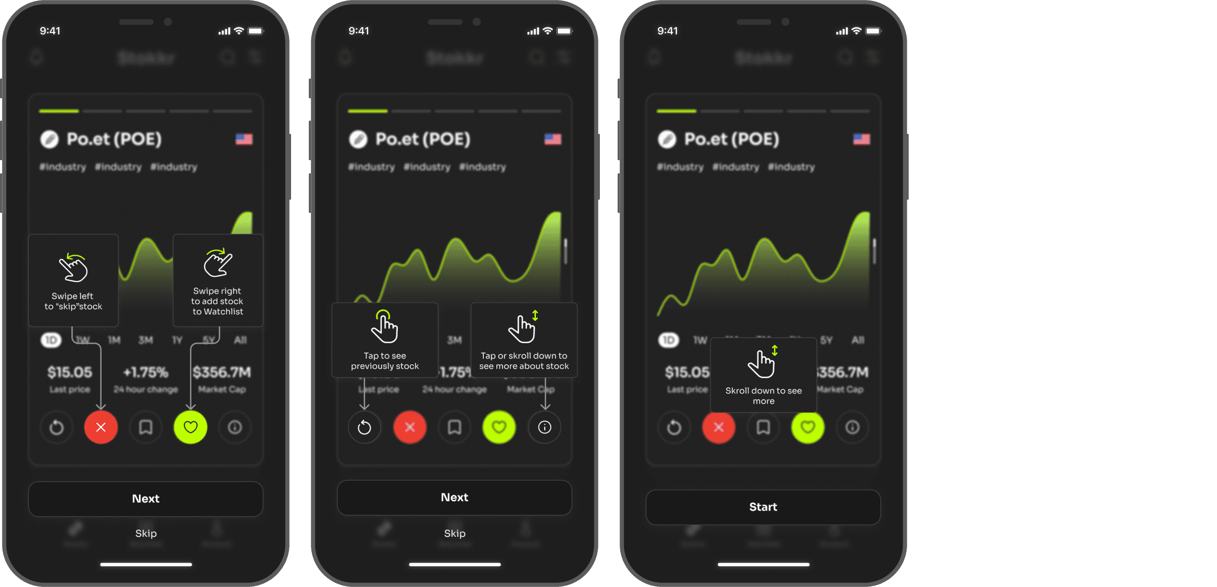
Explanation of tinder-style patterns
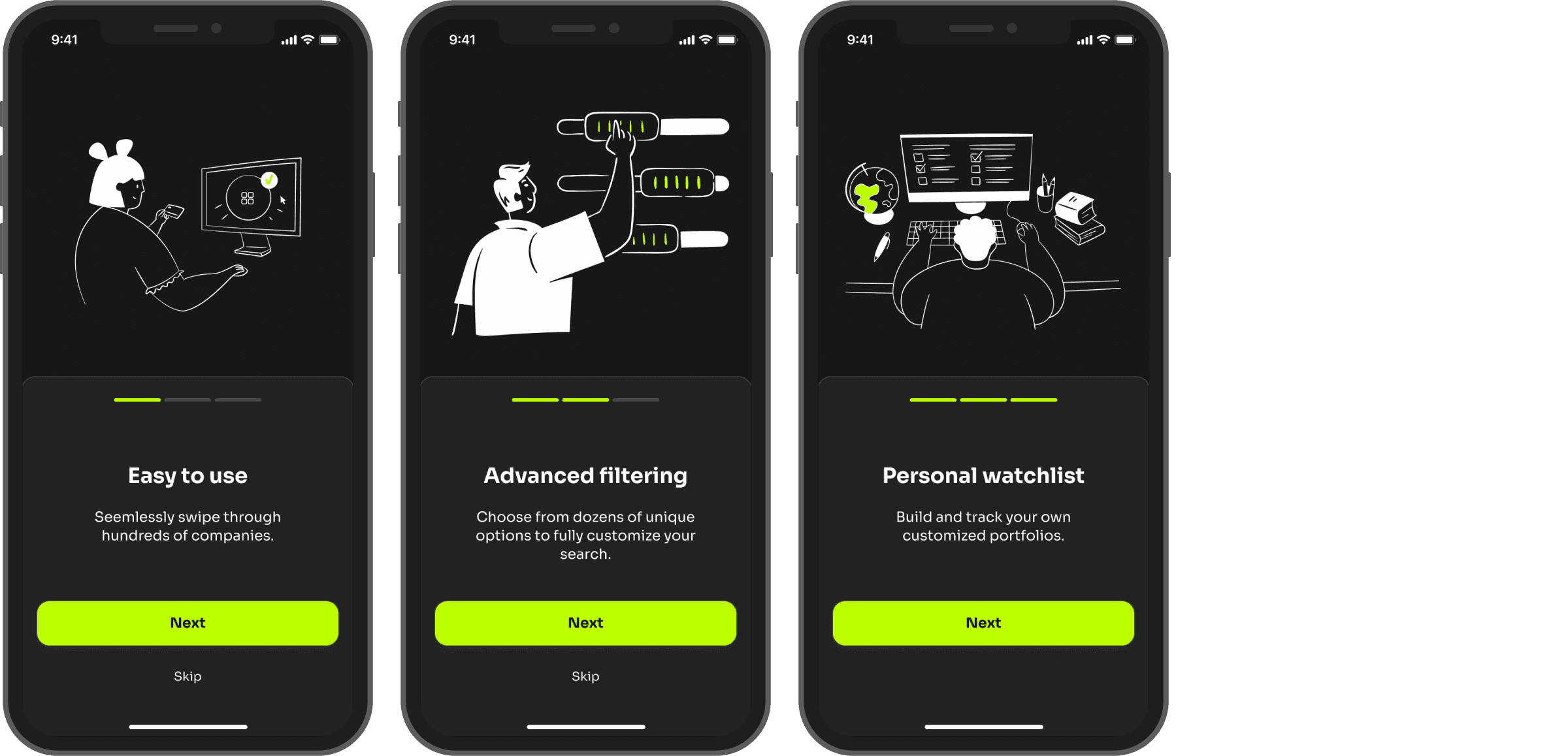
Because our product uses a swipe-tinder approach, we saw a risk that at first, some people might find this approach confusing. After all, not everyone uses tinder apps like this, so it was extremely important for us to teach them how to use the basic functionality. On the other hand, we didn't want to annoy people who are familiar with this approach, so we gave them the option to skip the explanation.
Stock data check out
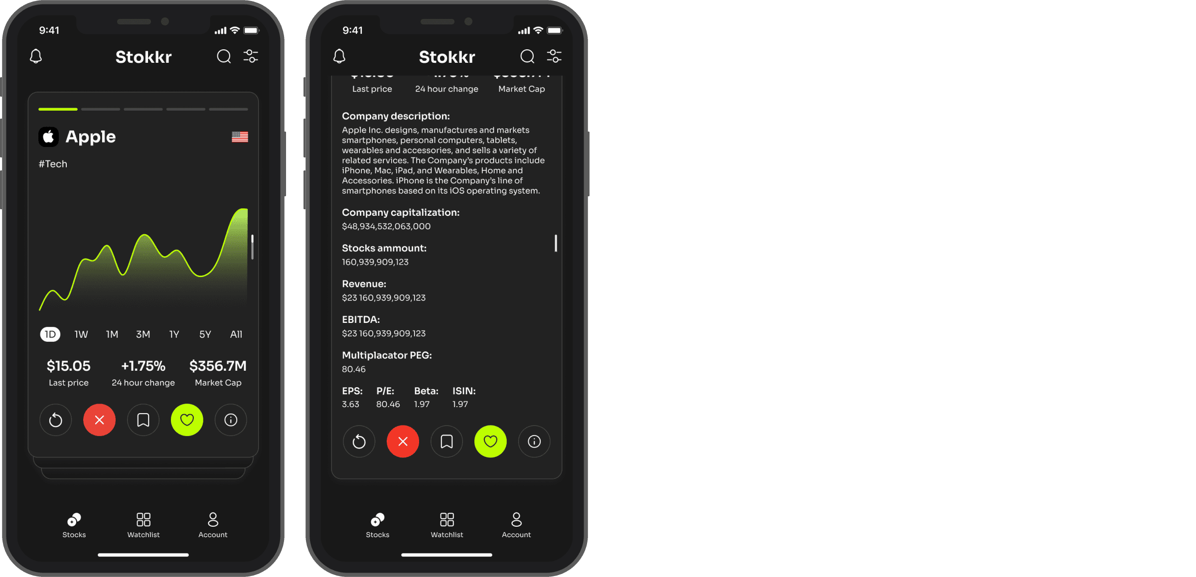
Basic information for beginners
In order not to overwhelm beginners with the amount of information they don't understand and get lost in, we placed the main decision-making info on the main screen + some additional information on the scroll, which allows you to get a little more than basic information, without overwhelming.
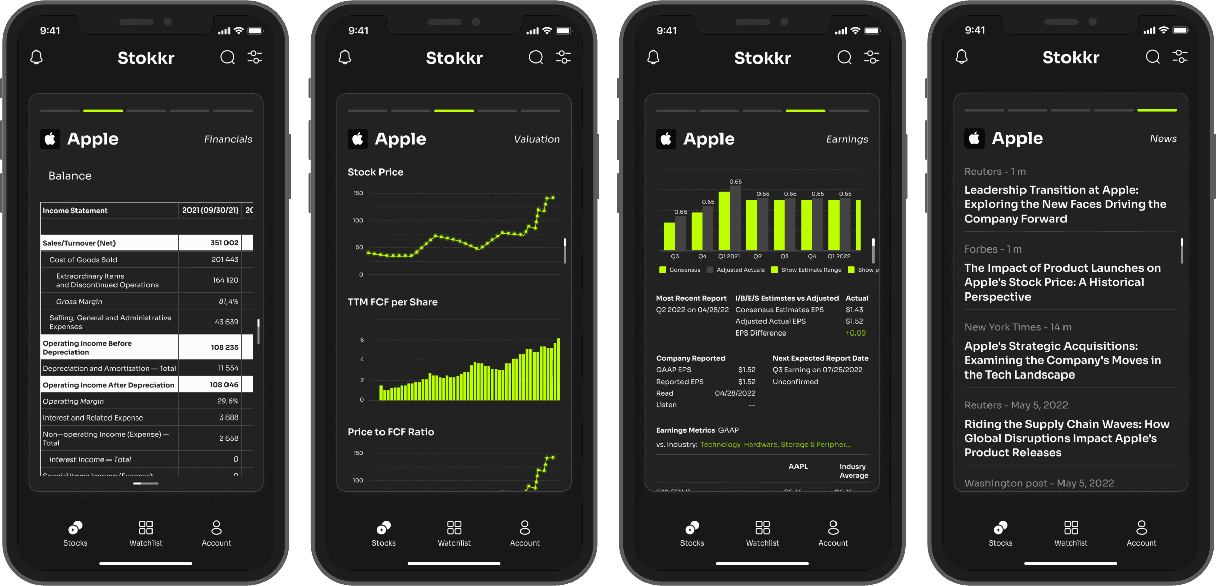
Advanced information for the experienced
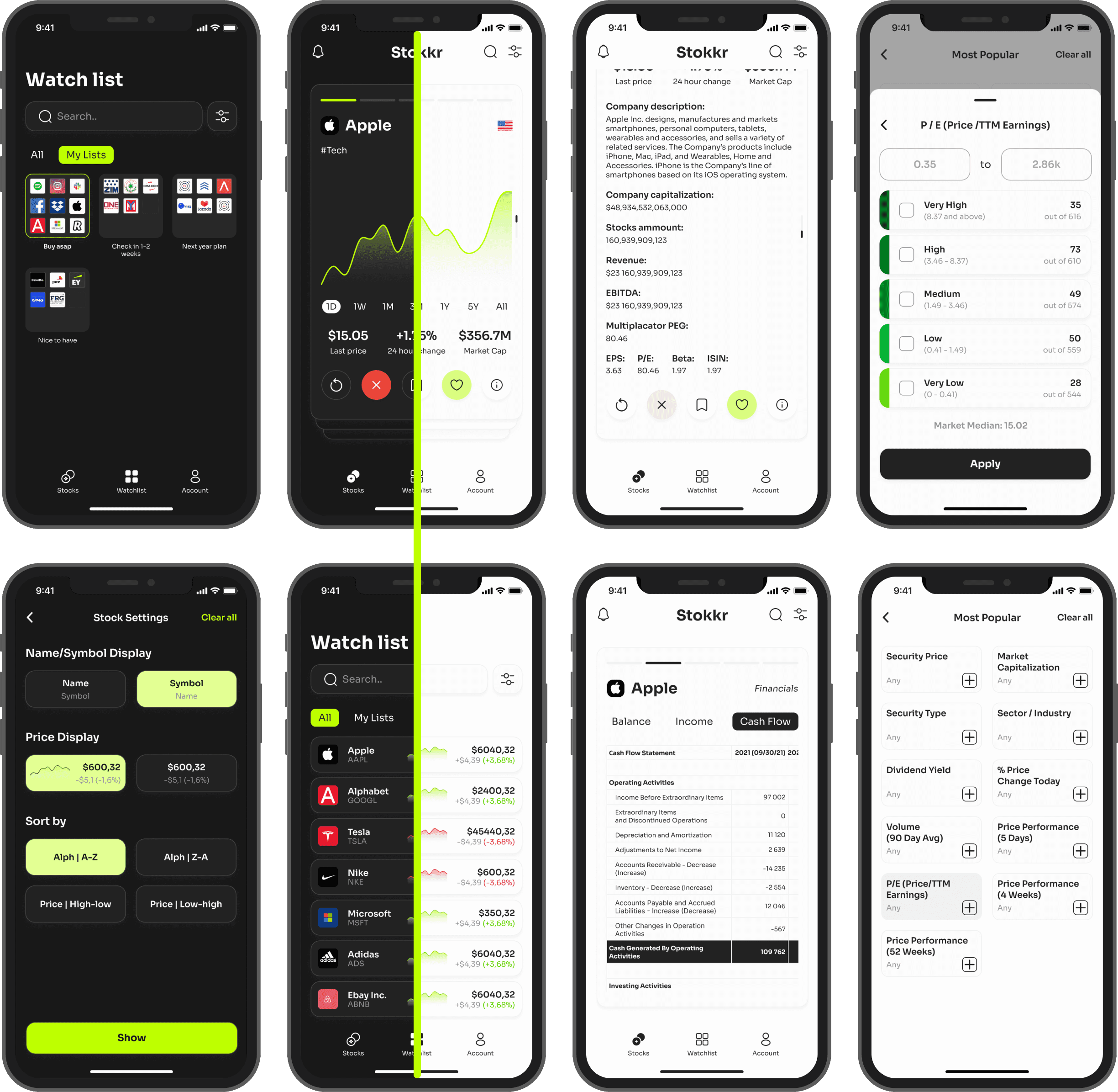
However, more experienced users, who need to analyze the campaign in depth, can easily access all the data that was previously available only in professional, legacy products.
Displaying such a large amount of information on a mobile device was a challenge, but we successfully met it and managed to achieve good readability and easy navigation between sections.
Also, one of the most unusual features is the addition of all open news related to a given campaign. That is, if a user wants to get acquainted not only with the data, but also with the news related to this company, its owners, etc., they can do it in one place without spending a lot of time searching.
Watch list
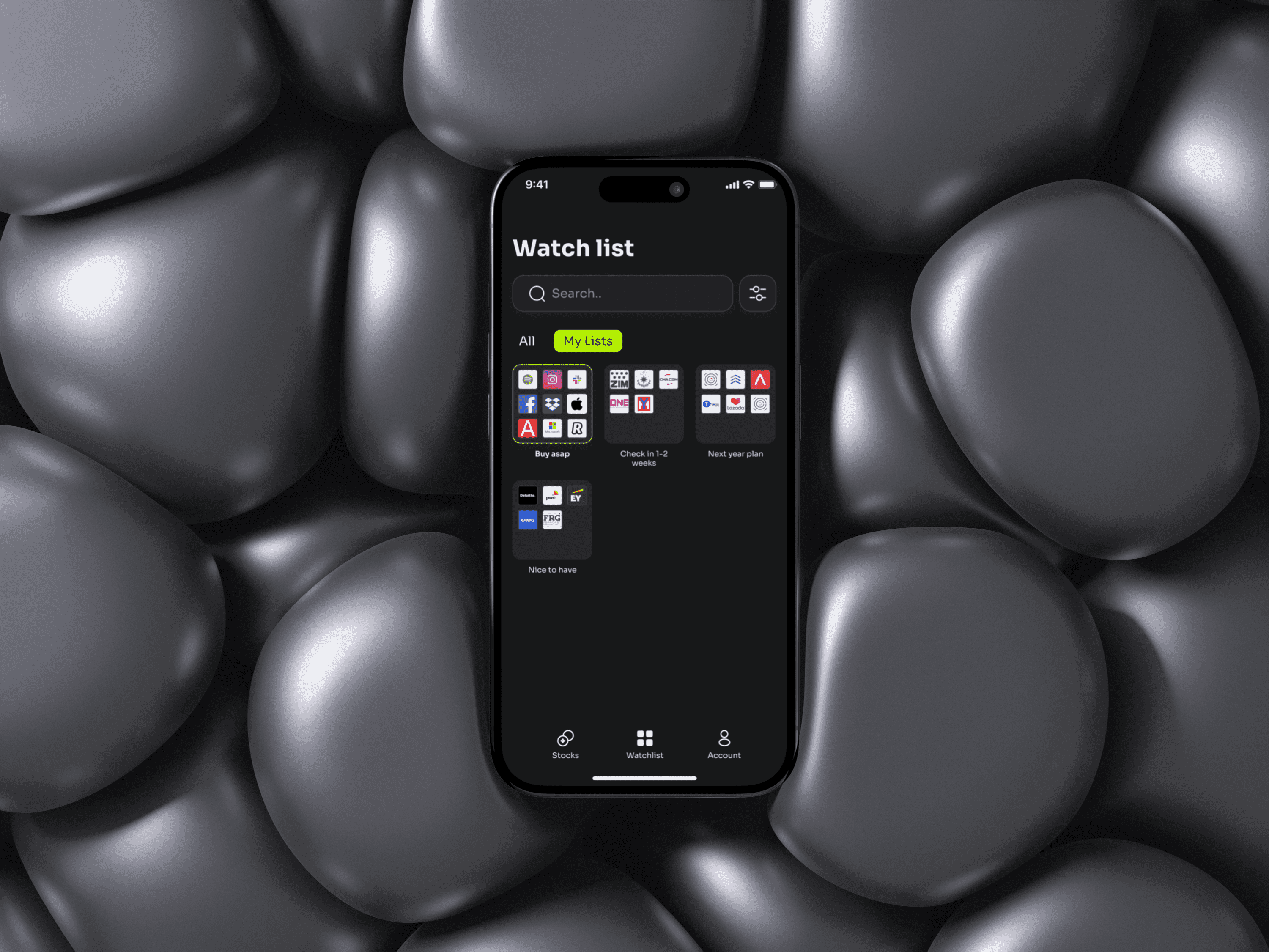
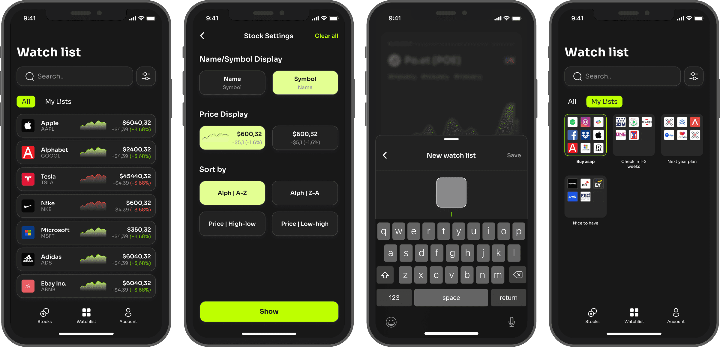
In order to provide quick tracking of the status of the shares of the saved companies, we have developed a watchlist that immediately displays basic information about the share before going to the share page. Also, we added the ability to customize the watchlist view so that the user can customize the view that suits them best.
It is worth noting the ability to create separate watch lists, with the help of which the user can categorize stocks in a convenient way
Advanced filtering
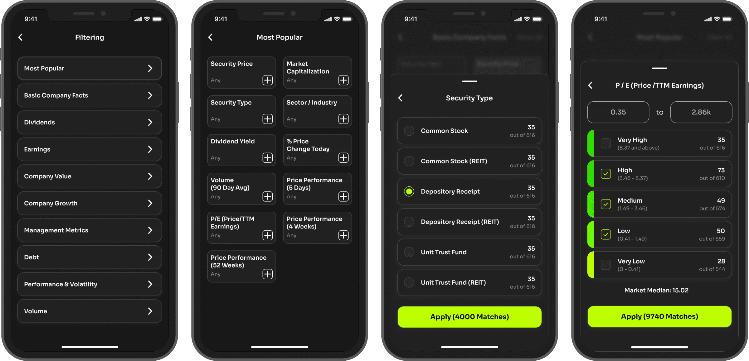
For experienced investors seeking deeper insights, our app introduces personalized stock filters. These filters empower users to finely tune their stock feed, tailoring it to their unique investment strategies and preferences. By allowing users to specify criteria, we streamline their research process and enable them to focus on the stocks that matter most.
This not only enhances user experience by providing relevant and actionable information but also fosters stronger engagement and loyalty. Moreover, this feature distinguishes our platform in the market, positioning us as the preferred choice for serious investors. As a result, we anticipate increased user satisfaction, retention, and broader market appeal.
Dark & Light modes
Prioritizing user preferences and needs, we initially introduced Dark Mode as a solution. We observed that many users preferred this option due to its reduced eye strain, especially in low-light environments. Then we decided to expand our offerings with Light Mode. By addressing the needs of users who prefer a brighter interface during daytime or well-lit settings, we demonstrate our commitment to comprehensive design solutions. This sequential approach allows us to cater to a broader range of user preferences, enhancing overall satisfaction and usability.
Main lessons learned
The moment you recognize that you're embarking on a project centered around a topic you're not familiar with, it's crucial to begin immersing yourself in that subject. Engage with YouTube reviews, take short courses, subscribe to expert blogs. This approach maximizes empathy and enhances your design perspective effectively.
When dealing with the demand for a significant volume of data in contemporary visual design, sooner or later, compromises become inevitable. At a certain juncture, the sheer volume of data can hinder the maintenance of a truly modern design.

